
Emissions data lifts the veil on the positive contribution of nuclear energy.
Written by Grant Chalmers
December 31, 2019

Watching and listening to the energy debate, particularly in Australia is very frustrating. I decided to see if there was any data I could analyse to see how different regions were performing in relation to CO2 emissions. The debate in Australia rarely portrays nuclear energy in a positive light so this is something I was keen to delve into.
A couple of years ago, I studied a Udacity Data Analyst nanodegree, which introduced me to R and Python. It was an Exploratory Data Analysis (EDA) topic, which required R that really spiked my interest in the scripting language. All the plots in this blog were generated in R with the quintessential ggplot2 visualisation library and extension libraries ggridges & gganimate.
While exploring for energy related data, I came across ElectricityMap, a great open-source project displaying real-time CO2 emissions on a global map, an amazing project for data nerds like me, as it is possible to gather these readings for any live zones in ElectricityMap via Application Programming Interface (API) and subsequently analyse in scripting languages like R & Python.
Information about the API can be found here.
My first job after graduating from University was with Western Mining Corporation (WMC) at the Olympic Dam mine in outback South Australia. Olympic Dam’s main products are copper and uranium. I was responsible for maintaining the Microsoft Excel based management reporting suite. My background is in Information Systems and working as the only non-accountant in a Finance team was almost as stressful as moving from Melbourne to the outback town of Roxby Downs by myself.
Working at Olympic Dam was an experience I will never regret. I met some great people and generated interest in two passions; data and nuclear energy. Some other highlights were the dark skies at night — fantastic for stargazing— and seeing Sturt’s desert peas in the wild.

I remember feeling envious of the countries taking advantage of the uranium oxide concentrate we were exporting to produce vast amounts of clean energy.
Nuclear energy tends to generate a negative emotional response in many people. I find it fascinating that those on the right side of politics tend to be ambivalent or be in favour and those on the left view it with disdain. It seems illogical because the left are more strongly associated with the environmental movement. Nuclear and hydro are technologies proven to deeply decarbonise electricity grids; just look at Sweden, Ontario and France — and nuclear doesn’t require damming and flooding like hydro does!

Note the difference between the top three in the above density ridgeline plot to South Australia and Germany, who are frequently promoted as renewable energy pioneers. In the density plots, the peaks help illustrate where values are concentrated. It illustrates the distribution (shape) of carbon intensity of electricity consumption hourly readings over the time period shown in the subtitle. Consumption takes imports and exports into account. South Australia has a flat distribution because they do not have access to firm low-carbon generation, like hydro or nuclear. While Germany has some nuclear remaining, they plan to shut this capacity down prior to shutting down coal generation, which makes little sense if your goal is to reduce emissions and air pollution.
I’ve included an alternative way of viewing the data below, which animates the carbon intensity readings over the same time period:
.gif)
The below box plot visualisation highlights how France and Sweden enjoy consistently low emissions due to nuclear and/or hydro, while Germany’s emissions are much higher and more variable throughout the day.While the above distributions are telling, it is also important to note that carbon intensity is declining in South Australia and Germany, albeit very slowly. Below is a longer term line plot depicting this trend.

While the above distributions are telling, it is also important to note that carbon intensity is declining in South Australia and Germany, albeit very slowly. Below is a longer term line plot depicting this trend.

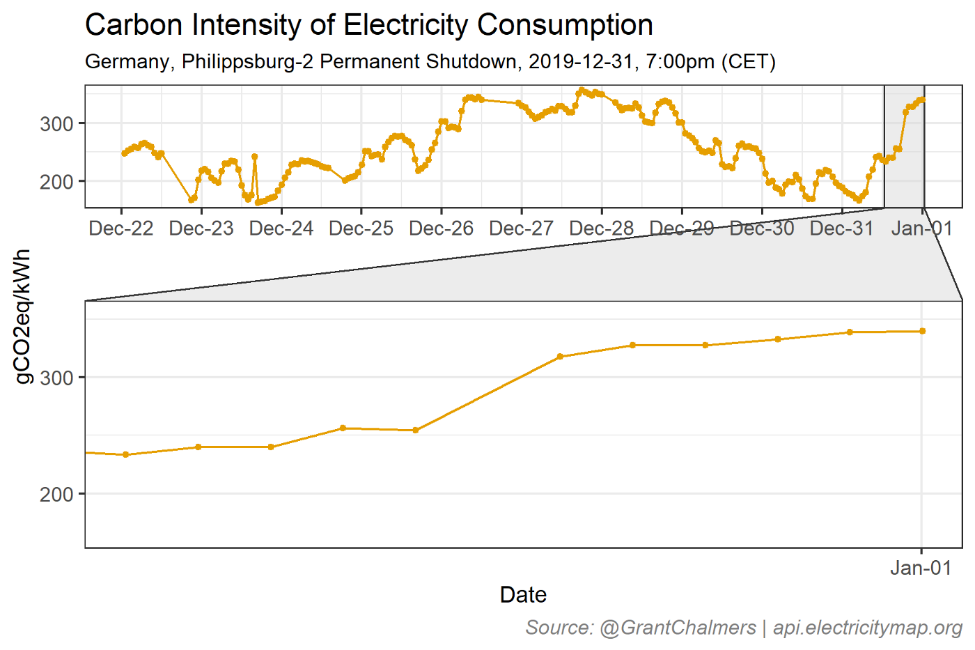
We can only hope this trend continues. It is however debatable whether the trend in Germany can continue with their Energiewende (Energy Transition) coming under increasing scrutiny on various fronts such as closing nuclear reactors prior to closing coal mines, delays in important high-voltage transmission line projects and problems with wind project construction permits. The 31st of December 2019 marked the premature closure of the Philippsburg nuclear power plant unit number two, which resulted in a step-up in emissions:
I find it interesting that the fossil fuel industry is interested in maintaining a partnership with renewables, particularly in relation to gas. My data clearly shows that it is difficult to firm variable renewable energy without fossil fuels, unless there is access to firm-low carbon generation, like nuclear or hydro.
While I’m a big fan of high-density electricity generation, I’m not a fan of high-density social networks aka, echo chambers. I try to follow a large range of people on social media to reduce the probability of finding myself in an echo chamber.
I used to think following only people who agree with my point of view was easier and it probably still is. Having said this, I try to broaden my social network and read more widely. I consider myself left leaning on energy related matters; I believe in global warming and support proven technology to deeply decarbonise the electricity generation sector. The risk of only following or associating with people who think like you, is that it is difficult for new information to enter your network.
Next up, I would like to analyse some data from the BP Statistical Review of World Energy June 2019, a freely available dataset that provides a rich view of global energy trends.